This Old House Idea House 2016

Hi Everyone,

Let me give a brief introduction to myself. I’m Liz, and I am the “Communications Girl” here at Merola Tile. I took over for Maggie over a year ago, and a lot has changed since then. We are still an unconventional company that sells unconventional products, and I am one of nearly 80 unconventional people that are now employed here. We still get Free Lunch Wednesday (yay for pizza and BBQ!) and we live on boatloads of caffeine. However, we have moved to a larger building with way more space to fit our hugeeee collection of products. And no, our pirate skeleton no longer greets visitors at the door… bummer!

That’s where the new chapter of our story unfolds….

We have grown and expanded tremendously, and one of those recent growths has been teaming up with This Old House to provide the tile used in the 2016 Idea House. I was fortunate enough to be chosen to represent Merola Tile and travel up to Devens, Massachusetts to see the initial reveal of Emerson Green and the Farmhouse. It was a remarkable experience and an amazing opportunity that I was so grateful to be given. It was rewarding to see all of the hard work that we had put into the project pay off when you got to see the reactions of the visitors, fellow sponsors, and most importantly, the homeowners.
IMG_1663.JPG

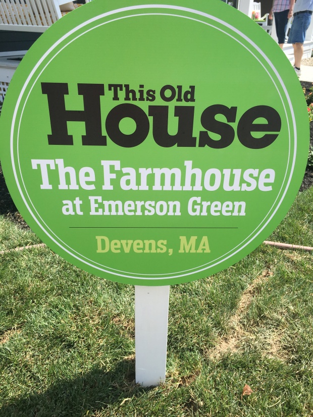
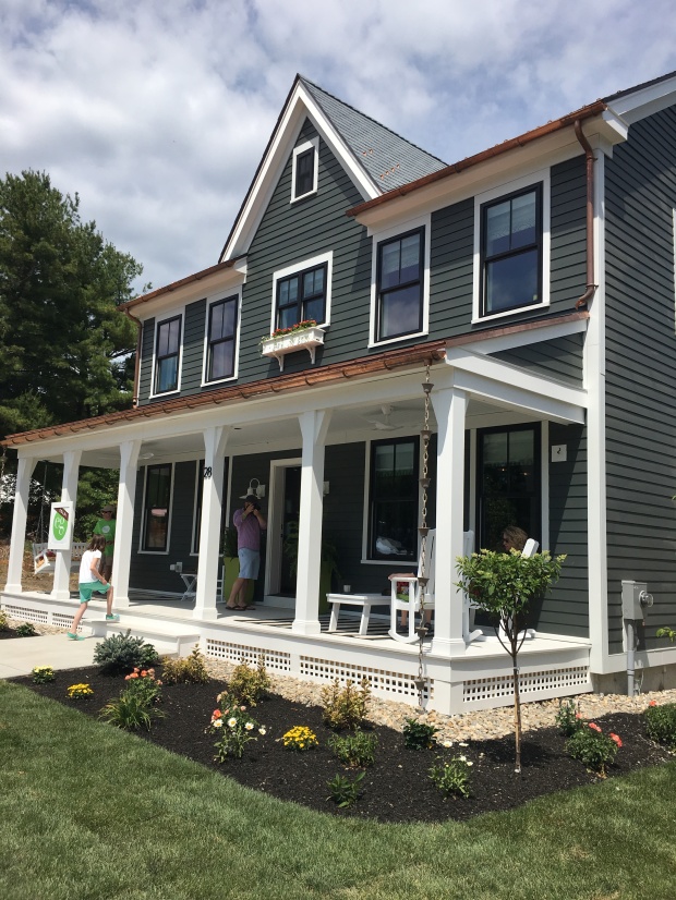
The Farmhouse at Emerson Green

Come take a journey with me throughout the day of the Emerson Green Block Party as I recall firsthand the sights and events of the big reveal of the 2016 This Old House Idea House.
IMG_1675_EDITED.jpg

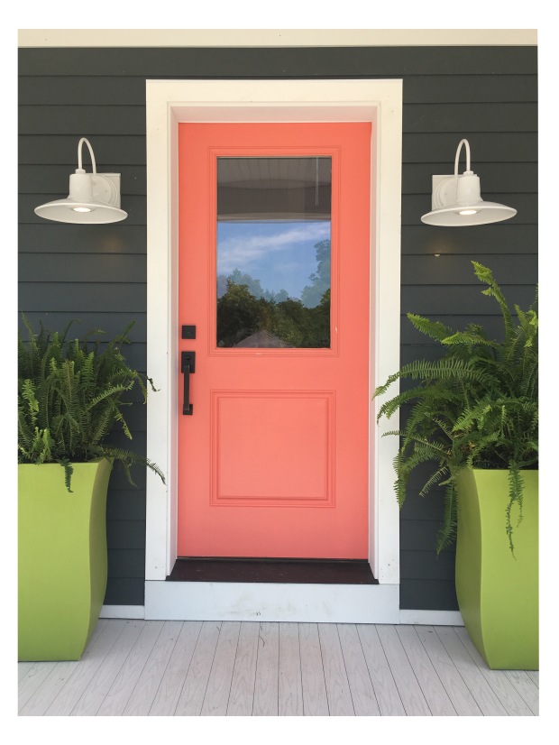
The beautiful coral door that welcomes you into the home. The pops of bright color look awesome with the grey.

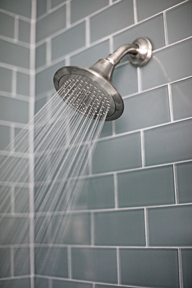
When we got to the block party, we went straight to the house to set up our information in the garage. The plan was to start by doing a lap of the house, checking out every room and looking at how all of our products were used. We first walked into the mudroom from the back of the home. This space had a lime green built-in with places to hang coats, leave shoes and other various items. The walls had white ship lap and tied together the farmhouse look with the modern lime green touches. When you look to your right, you see the kitchen and dining area and when you walk straight you walk into the hallway that leads to the downstairs bath and office space. The downstairs bathroom had our Tessera Blue Smoke on the wall of the shower and the Metro Hex 2” Matte White on the floor of the shower. The Tessera Blue Smoke looked amazing with the textured wallpaper that matched the color of the tile.
1016 Web EmersonGreen  IMG_0078.jpg

Tessera Subway Blue Smoke

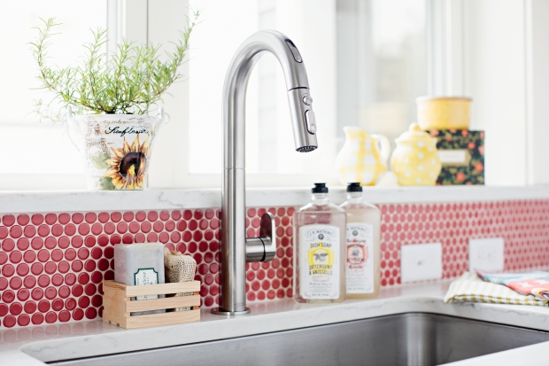
We continued through the house back around to the kitchen, where there were splashes on Hudson Penny Round Vermilio on the wall behind the sink and the stove. It looked great with the colors used in the kitchen (and I am usually not a huge fan of Vermilio when it is on the shelf, but it was beautiful installed).
1016 Web EmersonGreen  KITCHEN_ DETAILS_KITCHEN SINK_ 4.jpg

Hudson Penny Round Vermilio

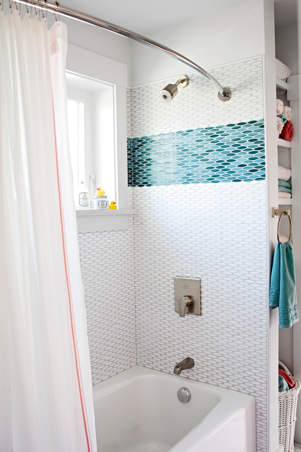
We proceeded upstairs and went to the right and found ourselves in the Jack and Jill bathroom, which featured the Pescado Aqua and Blanco walls and more Metro 2” Hex on the floor. The Pescados looked great paired together, along with the pink accents.
1016-web-emersongreen-j_j_bath_v2_finals_01-1

Pescado Aqua and Blanco

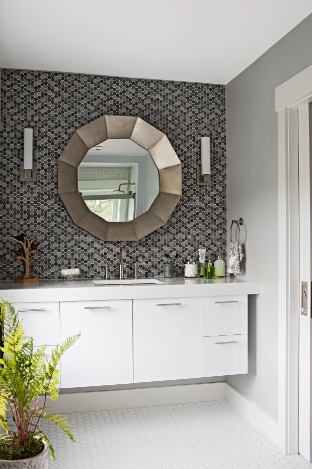
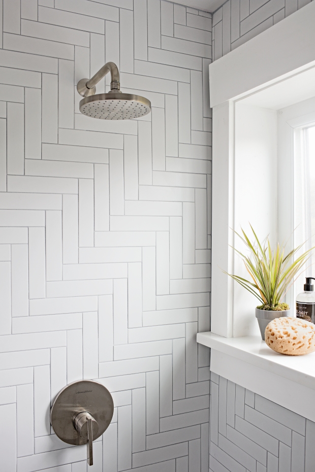
We made our way to the final space with our tile, the crowd favorite master bath. In here, they used Metro Hex 2” on the floors of the bathroom and shower, a herringbone Metro Soho Matte White in the shower wall, and the Structure Hex Lava Stone on the accent wall behind the vanity.
 

1016 Web EmersonGreen  SINK_FINALS_01 2.jpg

Metro 2″ Hex Matte White (floors) and Structure Hex Lava Stone (wall)
1016 Web EmersonGreen  SHOWERDETAIL_FINALS01 3.jpg

Metro Soho Matte White

After doing our initial run-through of the home, we finally found Claudia Jepsen, the Vice President of Marketing at This Old House. We were fortunate enough to snag a few minutes with her. She filled us in with insider details about project, including the past couple days leading up to that morning, and what the process was going to be going into this week. She told us that they were running so far behind that the tile guy was putting the grout in the Tessera Blue Smoke shower the day before and it was a mad dash to finish the house. They had the next day to make any last-minute changes and to clean up the home before the photo shoot that was Monday, Tuesday and Wednesday that week.

I was accompanied by a partner-in-crime, Monica, our eCommerce Analyst. We both spent time talking to different people who were walking through the home, answering any questions that they had about the project or our products. I used this time to take some pictures and to get feedback from people who were in the house as well.

We also got the opportunity to meet Christina Carlson, the Project Architect. Talking to her was very rewarding, as it gave us insight into the building and design aspects of the project. For example, she said the original intention was to use the Hudson Penny Round Vermilio in one of the bathrooms, and motioned towards the downstairs bathroom with the Tessera Blue Smoke. However, after they received all of the products, they decided that it was best for them to use it how they did in the kitchen. Also, she said that the tile installer loved working with our products. He was very excited to use them to install in the home and had a great experience with it.

We spent a few minutes walking through Emerson Green as well. Emerson Green is the new community that the Idea House is in. There are currently about 12-15 houses that are in the process of being built on the street, and most of them had already sold. We went inside and got the chance to see what the rest of the community would be like. One thing that we admired about it was that each home was unique and it was not going to be a cookie cutter community.


However, possibly one of the most rewarding parts of the day was meeting Paula, the homeowner. Her and her young family, including her husband and two young daughters moved into the home in early September. She raved about our product and how great it all looked. She said that her favorites were the Tessera Blue Smoke and the Structure Hex. She took a moment to grab the two us and question us about how to design a part of her kitchen. When installing tile in the kitchen, they didn’t install tile on the opposite side of the room, where there is a long stretch of cabinetry, but no backsplash or anything. She felt that this space needed some form of tile, and asked for our opinion and suggestions for coordinating product. One suggestion I had made was extending the Vemilio around to the other side of the room. Other suggestions included the Hudson Penny Round in White and the Metro Lantern White, because she had mentioned that she loved that shape. I wrote up a these suggestions and left them for her, along with my contact information so she could get in touch with us. She was so appreciative of the help and loved the suggestions we offered. Overall, seeing her satisfaction with the home and our product was the highlight of the trip. I was so pleased to see how happy she was with the results.

1016 EmersonGreen PORTRAITS_V2_FINALS_ 76.jpg

Overall, the event was very beneficial for me to have gone to and to have experienced. I was honored to have been given this opportunity as a representative of the company.

… And that’s the story folks! That was my day in a not-so-small nutshell. Yes, I am aware I can write a lot, but that’s because I can talk A LOT. I hope that you enjoyed a look into my day at the Idea House. The first article about the house hit newsstands in October and there is one more article expected to hit shelves soon. Be sure to pick up your copies of This Old House and let us know what you think of the final project!

See ya soon! xx
IMG_1677.JPG

Writing With Hex Tiles
Custom tile can be expensive. With a little creativity, you can create your own custom one-of-a-kind floor or wall installation that is low cost and high style!

Hexagon tiles are one of the most classic looks in the industry. They have been around for decades, creating looks ranging from simple to complex designs with a timeless appeal. Most commonly, you see these tiles with colorful hexagon flowers or dots to add a simple design element to the living space. However, you can also find where people use these tiles to write words and numbers to create custom designs.

Writing with hexagon tiles is great for expressing your creativity, whether it is for something fun to show your personality or for practical use. Business owners and homeowners alike both take advantage of this exciting project. Hexagon tiles can be a creative way to display your address, business or personal name, and give directions, advice or information.


GIF.gif

A mashup of projects submitted by our friend Charlotta

Writing with hexagon tiles requires prep work to yield the best results, but all of this hard work will pay off when you see the final outcome. When you know what you want to write, there is a fun website called Grid Paint which is a Google site that allows you to draft up a hexagon grid so you can see exactly how to arrange the hexagons and how many you should expect to need without having them in front of you. Other than the fact that it is just fun to color in these little hexagons, this will make the installation process run smoother. Don’t underestimate the importance of prep work. Doing the simple legwork can help assure that you purchase enough product for the installation and your words don’t come out lopsided, making it less time consuming overall.

Create Gridpaint video  _Thumb.gif

Screen shot from Grid Paint


For the most part, these tiles come mounted on a mesh backing, which allows you to easily remove tiles from the mesh where they are not wanted, and replace them with other colors. We do not recommend that you glue these other tiles onto the mesh, but just place them in in their position around the mesh- mounted tiles. Glue acts as a bond breaker and could cause problems for the installation. Before actually using thinset, you may want to lay these mosaics out to see how they look, if they line up where you want them, etc. before permanently bonding them in place. This gives you one final chance to review your project and see how everything is laid out.  As I mentioned, prep work is key, and in my opinion you can never prepare too much.

Now, you need to choose grout color. Keep in mind that grout can change the entire look of this project, so you will want to plan that choice out before as well. To see how drastic of a change grout can make, check out one of our previous blog posts that highlight the effect grout can have on a final project.

Check out this quick step-by-step guide to successfully write with hexagon tiles:

  1. Decide what you want to create and where you want it to be installed.
  2. Figure out what tile colors and grout color you want for your installation.
  3. Use Grid Paint to layout your work. This will also help with deciding how colors look together and getting an estimate on how many tiles you need. (We always recommend buying 10% overage to account for cuts and future repairs)
  4. Purchase all of the tile, adhesive, grout, sealer and tools necessary to complete the project.
  5. Lay out your design in your space without thin-set to get a feel for final look before permanently installing in place.
  6. Install this tile with the thinset.
  7. Use grout to set the look in place.
  8. Seal your project if desired. (Always seal the grout)
  9. Enjoy your new space!
RetroVation_Board.jpg

An example of one of our grouted boards, inspired by our new Retrovation Bays at select Home Depot stores.

I hope that this was helpful for your next creative tile job. Keep in mind that these tips can be used in other tiling projects as well, not just writing with hexagons. If this helped inspire you to try a project like this, you can use our entire collection of hex mosaics to create your own masterpiece. Do you plan on doing this or have you done this before? Send us pictures and tell us about it! We would love to see them and feature them on our website and social media! You can send these to us at photos@merolatile.com or through our social media. Good luck!

Product of the Week: Plank Beige

Looking for a wood look tile that stands apart from all the rest?

This is available through Home Depot.

This is available through Home Depot.

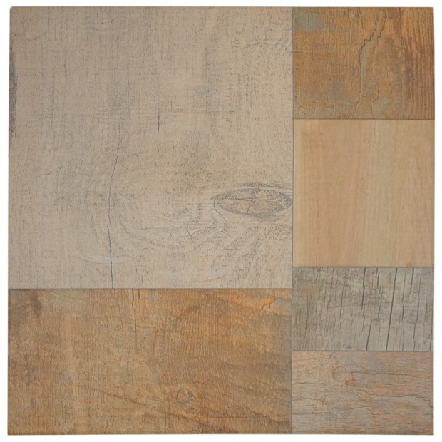
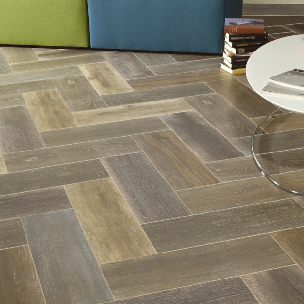
The Plank Beige porcelain floor and wall tile is a newer item, and its elaborate patchwork glaze is something truly unique and daring.  With multiple finishes all in one porcelain square, the wood look you want (and then some) is here.  With an overall beige palette, you’ll find super-realistic segments of wood finishes in varying shades of warm beige: distressed, stained, aged, or even unfinished (like plywood).  It’s seriously cool- patchwork tile is relatively common, but to have the same effect with wood? There’s nothing like it.  It’s almost a wood-look mosaic.

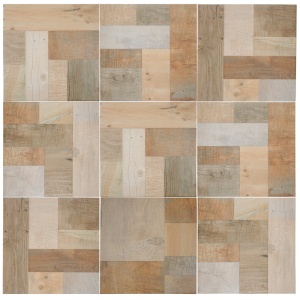
Another good thing about this is that every box comes with a lot of variation in the pattern. You can get creative with how you lay it out, personalizing it exactly to what you want.  That kind of flexibility is difficult to find with wood-look tile, but you can get it here. Here’s a sample pattern set up by our photographer:

FCG17PLB_Plank_04A_EC

The Plank Beige patterns.

It’s durable enough for an outdoor setting and it’s slip-resistant, which means it’d be fantastic for a rustic poolside look- the contrast that wood floors provide to the cool blues of pool water invariably look great, and this would be no exception. Look at an example of wood by a pool in this tranquil setting:


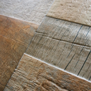
The detail is also incredible.  Each finish is meticulously emulated down to the finest detail, including the texture.

SONY DSC

Detail of the Plank Beige, a beautifully ornate wood look tile.

This captivating and unique wood mix will definitely turn heads.  Take a look and fall in love with this realistically rustic tile!

Fall Colors for 2014

It’s true: in just a few days, summer is unofficially over.  While children grapple with the levity of needing to go back to school, those with jobs grapple with the levity of an entire summer going by… again.  As we approach fall, however, some of us start thinking towards our next home project: how do we make our homes fashionable and still timeless?

The answer, of course, is in the colors. Pantone’s Fashion Color Report for fall 2014 has a lot of versatile colors whose appeal remains steady through the ages:


Courtesy of Pantone.com

Courtesy of Pantone.com

What a beautiful array of shades! So how do you tie this selection into your home décor? There are little things you can do to pull these colors into your home. Accents are key- pillows, tablecloths, furniture, appliances, artwork, and even the occasional accent wall are just a few ways you can keep your home up-to-date.

The chairs are one of the many pieces of this kitchen that blur the line between kitchen and dining room.

Our Tessera Subway Sage, available through the Home Depot, is a deep green that would make the perfect backsplash in this crisp, clean fall color.


This accent wall brings joy to a sleek, modern space, keeping it from seeming sterile.

For those that want to get a little bolder, it’s worth noting that a lot of these colors have been mainstays in home décor for decades and some bring a distinctive vintage charm to a space. Check out our Penny Round Vintage Yellow in this sunny kitchen. This is a perfect shade to blend in with vibrant fall leaves or to accommodate the bright light of spring.

The Penny Round Vintage Yellow is available through the Home Depot.

The Penny Round Vintage Yellow is available through the Home Depot.

Mixing the blue and yellow may be a bit predictable, but the pops of color and chic, modern tile lend balance to this otherwise rustic kitchen:

A tile that would make this setting a little more bold and exotic would be our Metro Lantern Glossy Blue tile, pictured below.

This is available through the Home Depot along with our full range of popular lantern mosaics.

This is available through the Home Depot along with our full range of popular lantern mosaics.

Some of the home décor pairings that are surfacing from these colors are fun and original. This eclectic mix of styles comes together boldly and combines the pink shades and the royal blue in this fall’s palette:

This palette is the perfect mix of neutrals and bold colors, however, making it suitable for a range of purposes. The Aluminum shade is a versatile pick that can be understated or coupled with other shades to really make a statement. Here it is in our Concret Rombo Vigeland:

ConcretLouvre

This tile is available through the Home Depot.

The options are limitless with Pantone’s Fall 2014 color palette, and a range of versatile hues is great for the homeowner looking to apply ageless style to their space.  Whether you jazz up your home with a toaster or a tub surround, go with the wisdom of Pantone’s palette.

Add a Dash of Backsplash

Do you think your bathroom or kitchen is missing a certain something? Are you looking for a relatively easy, cost-effective way to jazz it up? Perhaps we’re biased, but a backsplash is a great answer.  It doesn’t just add color- it totally shifts the focal point of the room, making it feel like an entirely new space.  It’s also possible to find product to suit any décor style.  If your taste leans towards the dramatic, a glass blend mosaic would probably do the trick to add the perfect splash of flair:

This customer-submitted photo of her installation of our Tessera Piano Nassau (available through the Home Depot) is proof that a bold mosaic doesn’t necessarily have to dominate the entire look of the room.

However, if you tend to appreciate a little more subtlety, there are a number of more subdued looks up for grabs, even in glass mosaics.  Take a look at this image of our Tessera Subway Blue Smoke: it’s not intrusive, but it adds a welcoming splash of color.


The Tessera Blue Smoke installed in a kitchen.

This is available through the Home Depot.


Convinced that a backsplash is your ideal solution to a lackluster kitchen? Fantastic! Here are some tips on how to plan one out using typical measurements and points of reference.

How do I Plan a Backsplash?

Start by visualizing it.  It’s usually best to center the backsplash behind a sink or a cooktop- there must be a focal point.  Once the focal point has been determined, use graph paper to plan around outlets, cabinets, windows and appliances.  Though the backsplash should cater to your specific requirements (factor in the practical uses of your kitchen, any storage needs, and physical capabilities of those using the space), the average backsplash is about 15”-18” high- the height from the counter to the base of the upper wall cabinets.


How do I calculate square footage?

When installing tile, you will be measuring the required coverage using square feet. This entails measuring the length of the space (in feet) and multiplying it by the width (in feet).  If you are tiling more than one room and require a combined number of square feet, simply measure the square footage of each space individually and add them together.

How much overage should I purchase for my project?

We highly recommend purchasing 10% more tile than the exact calculated square footage. This is to account for cuts, possible breakage, and any future repairs needed- if you need to touch it up later on, the tile may not be available, or what we have may not match your current installation.

When purchasing your tile, please make sure to note the square footage per box or sheet.  They aren’t usually split into an even number of square feet so it’s important to know how much you need.

To calculate your total (including recommended overage), follow this example:

If your backsplash area is 10 feet x 3 feet, you have 30 square feet that need coverage. Move the decimal point over once to the left- that’s 3, which is 10% of 30- and then add that number onto the square footage. You would need to purchase 33 square feet of tile in order to meet your requirements plus to recommended overage.

An advantage to having some leftover tile… maybe you can make your backsplash a little bigger than originally planned! Take a look at this one, which goes all the way to the ceiling:


If you’re looking for some stainless steel tile, we have a variety of items that make fantastic backsplashes! Check out our whole selection here.

If you have any questions, as always, get in touch! Don’t forget: take a photo of your beautiful installation of our products and send it over to photos @ merolatile.com- you’ll be entered to win a $25 gift card!

Follow us: Facebook :: Pinterest :: Twitter :: Houzz

We’re Number One!

So this happened:

Click the photo for a more in-depth description of this product on HomeDepot.com!

Click the photo for a more in-depth description of this product on HomeDepot.com!

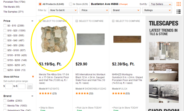
Merola Tile’s Attica Gris is the BEST SELLER on HomeDepot.com! We’re so excited and couldn’t be more proud. Our Attica series in general is stellar and a cost-effective and low-maintenance alternative to natural stone, and we’re so grateful to all the customers that purchased this tile and love it as much as we do!

Product of the Week: Crag Subway Sunset

Bringing nature home is a lot easier than you’d think.  Our Crag Subway Sunset is a subway mosaic made with natural slate.  Though the word “slate” is associated with deep gray and black (it used to be used as chalk boards!), it’s far from a plain stone tile- its palette of earth tones, rust, gray, and blue is full of character and adds a rural touch anywhere.

The Crag Subway Sunset is available through the Home Depot

The Crag Subway Sunset is available through the Home Depot

Slate has been used as a building material for centuries- the first recorded instance of its use as a roofing material was in 1287.  Time has proven it to hold up well against the elements, keep its dramatic natural beauty and its hardy endurance over time.

This angled shot shows some of the intricate coloring of natural slate.

This angled shot shows some of the intricate coloring of natural slate.

Something that makes it great for a tile is that it breaks smoothly. It’s a foliated metamorphic rock, meaning it slices in a clean, flat plane when struck by the right instruments. Its fine grain makes it highly slip-resistant and ADA-compliant.
This look is suitable for a lot of different spaces. Check out some applications of slate tile in a modern setting:

I love this because while you’d think a black tile would dominate a space, it doesn’t do that at all. The sunlight and light blue tile temper it beautifully.


Look at how this beautiful, multi-colored tile works with just about any finish! The dark wood pulls from some of the rich tones in the stone, and the metal appliances and fixtures complement the lighter gray slate, pulling everything together wonderfully.


And of course its rugged appeal is the perfect fit for an all-natural feel. Check it out in this cabin:


Here’s a rustic farmhouse-style kitchen that uses the colors and stone very well:

It’s a warm and welcoming look, with a rugged inviting touch. There’s no mistaking that timeless subway shape, but it breaks the mold with its organic appeal, which is anything but urban.

For its versatility, breathtaking color palette, and hardiness, the Crag Subway Sunset is this week’s Tile of the Week.  Check it out on HomeDepot.com!

Sources: here, here, and our resident experts.

Summer Fun

Summer is in full swing, and we’re happy to bring you some of our favorite images from the home décor set.  A hot day is made infinitely better when you jump into a pool… an experience made even better when the pool is luxurious and beautifully tiled!

This is a customer-submitted photo of our Modena Cobalt Blue tile installed in their pool. It’s a classic look!


This is available through the Home Depot.

This is available through the Home Depot.


If you’re looking for something a little bohemian, this is very similar to our Coppa Brown Gold and the way it plays off of the shade of the pool water is incredible.

This tile is available through the Home Depot.

This tile is available through the Home Depot.  Photo from Pinterest.

Here’s a way an installer has used tile to make the pool space lush, verdant, and beautiful. This is comparable to our Resort Palm Green tile:

Photo from CasaSugar.com

The Resort Palm Green is available through Home Depot. Photo from CasaSugar.com.

We have a whole Pinterest dedicated to hanging out all summer, and it’s perfect when you’re looking forward to your weekend. Take a look here and give us a follow!  Happy Friday!

Product of the Week: Avila Arenal Decor

Last week’s Product of the Week was the Revival series, a collection of tiles that looks great laid out in patterns or mixed together. For fans of the charming shuffled look, we recommend the Avila Arenal Décor, which is a ceramic floor and wall tile that has the look of a mosaic of cement tiles without having to meticulously lay down each piece.  Instead, one 12-1/2” x 12-1/2” square takes care of that for you:

The Avila Arenal Decor is available through the Home Depot.

The Avila Arenal Decor is available through the Home Depot.

The Avila Arenal Décor is a ceramic tile with a rustic look that recalls European floral and Islamic patterns.  It has a slightly glossy sheen and a texture that makes the look more distinctive- the gloss finish accents certain parts of the tile, with other parts in a matte sheen.  Even though it looks like a mix of individual tiles, it’s one square piece with a unique glaze encompassing a range of colors and patterns. This is ceramic, so it’s worth noting that while it’ll look great outside in milder climates, it’s not frost resistant- so if you’re in a place that sees extreme weather, this is not the tile for your patio or outdoor space, but it’s great in most indoor residential applications!

This angled shot shows the varying finishes on the tile.

This angled shot shows the varying finishes on the tile. Taken with my cell phone, so apologies for any quality issues!

As previously discussed, the encaustic tile collage is definitely back in style, which is why this is so great. That look works in so many settings. Check it out in this contemporary bathroom:

By keeping the rest of the space low-key, the focus can be on the colors and patterns of the floor.   If you want the pattern to be the center of attention without taking up the entire space, you can always frame it with a more understated piece. It works here, with Avila Cotto, the field tile complementing our product of the week: FPM12ARD_UPC_AvilaArenalDecor_RmScene   Here is a similar layout on Houzz:

If you’re looking to try the same effect with our product of the week, the Avila Cotto is the field tile meant to coordinate with it.  It’s quite a versatile piece, with its rustic, worn look. It’s great for anyone wanting to add a subtly natural touch into their space. It’ll definitely add personality if you pair it up with a tile that looks like it could have been plucked right off of the same patio in Spain!

The Avila Cotto is available through the Home Depot.

The Avila Cotto is available through the Home Depot.

For its creative mix of finishes, range of patterns and mosaic look without being half as time-consuming as putting one together, the Avila Arenal Décor is our product of the week. Take a look at this tile, and the other pieces in the collection, over at the Home Depot website.


Don’t forget: We’re on Twitter, Facebook, Pinterest, Houzz, and Google+. Give us a follow! We can’t wait to talk to you.

Glaze Application and Dye Lots

Glazing methods have advanced as the technology has evolved.  While screen printing used to be the primary mode of transmitting the images and color onto tile, the introduction of digital imprinting has revolutionized the industry and provided boundless opportunities for patterned tile.

Even though the patterns are consistent, it’s inevitable that as different batches are produced certain factors vary slightly.  Each different manufacturing run is called a dye lot, and it refers to the tone as well as the sizing of each individual unit of tile- these factors can vary up to 10%.  Acknowledging this is important: the cartons are marked with dye lots (usually abbreviated with a T and a C for tone and caliber) and each individual order will be pulled from the same dye lot.  We advise that you keep the dye lot number handy in case you need additional tile so we can try to provide an exact match.

For reference:

  • Screen printed tile has a “frame” effect, as they are imprinted per individual tile:

Image

Our Westport Marron is a screen printed tile.

  • Digitally printed tile goes right to the edge and continues to other tiles. This is how wood-look tiles are able to look more realistic; the pattern varies on each tile, which helps them look more authentic.
Our Castle Antic is a digitally-printed wood look tile.

Our Castle Antic is a digitally-printed wood look tile available through the Home Depot.

When making your tile purchase, be sure to look at this detail! It’ll be helpful to tell exactly what type of pattern you’ll have.